Skip to content

ENGR 1 Mini-Hackathon · Process portfolio

How we built Thought Dock

Students lose good thoughts because every app asks them to organize at the exact moment they have the least attention to spare. We split capture from sorting.

Team
Luke, Nikhilesh (Nik), Maryam
Theme
Making an Accessible World: Every Dog Has Its Day
Deliverables
Individual design reports and one team presentation (15 min max)
Capture on the phone (left) and Sort on the desk (right). Illustration drawn with the app's design tokens; the live screens are at /capture and /desk.

01 Marketing

Capture now. Organize later.

We wrote the positioning before the first screen, so every design argument could be settled by asking whether it kept that promise.

The method
Positioning names who the product is for, the problem it solves, and how it differs from what they already use. Messaging pillars are the few claims every piece of copy has to support.
How we used it
We wrote one positioning statement, picked a four-word tagline, and drafted the landing page, a launch video, and a campus launch plan from the same four pillars.
What it changed
The tagline became the product's structure: two screens, two moments. It also ruled out features that pull organizing back into capture, like a category picker on the phone.

Positioning statement

For students who think faster than they can organize, Thought Dock is a two-part notes app that keeps capturing and sorting apart. To-do apps want a list, a date, and a tag before you can save. Thought Dock saves first and lets you decide later, at a desk, one thought at a time.

Audience

Students juggling classes, work, and commutes, from community college to university.

It is built to help students with attention difficulties, anxiety, executive-function friction, or decision fatigue. We don't market it as an ADHD app: it should feel useful to every overwhelmed student, and nobody should have to identify with a label to use it.

Messaging pillars

  1. 01

    Nothing to decide

    One field and a Save button. No lists, dates, or tags while you're walking to class.

  2. 02

    Sort when you sit down

    The desk shows one thought at a time with big labeled actions, so the pile has an end.

  3. 03

    You stay in charge

    Suggestions are a quiet chip you can ignore. Every action can be undone. Nothing is filed for you.

  4. 04

    Free, no account

    Pair your phone with a QR code. No sign-up, no subscription, no extra device to buy.

Launch plan: campus channelsSmall, permission-first, and measured by what people actually say back.
WhenChannelWhat we post or askWhat we watch
Week 1ENGR 1 demo and class group chatsShow the 60-second capture-to-task flow liveWho asks to try it after class
Week 1Study groups and STEM club channelsPost the launch video with the /capture linkReplies and questions in the thread
Week 2Tutoring and learning centerAsk to leave a QR flyer at the front deskWhether staff agree to share it
Week 2Disability resource centerOffer it as one optional tool, ask for feedback firstTheir accessibility notes, before any wider push
Week 3Campus newsletter or student InstagramShort story: why capture and sorting are separateWhether it runs; feedback we receive

Sample post · Instagram / student page

Draft

You remember the deadline while you're on the bus. By the time you're home, it's gone.

Thought Dock is a free app from three ENGR 1 students. Type or say the thought on your phone and put it away. Later, at your laptop, sort everything in a few minutes: tasks, events, class spaces.

No account. Pair with a QR code. Capture now, organize later.

Sample post · class Discord

Draft

hey all, we built a thing for our hackathon and would love a few people to break it

it's an inbox for random thoughts. phone side is one text box. desk side lets you turn stuff into tasks or calendar events one at a time. works offline, no login.

link for your phone: [/capture link]. tell us what's confusing

Copy drafts are for Luke and Maryam to rewrite in their own voice before anything is posted. Nothing has been published yet. Source for every link: GitHub (opens in a new tab).

02 d.school design thinking

From a crowded head to one clear point of view.

We followed the Stanford d.school sequence, looping back from prototype to define more than once.

The method
A human-centered process in five modes: understand people (Empathize), frame the problem (Define), generate many options (Ideate), make them real cheaply (Prototype), and learn from users (Test).
How we used it
We moved through all five and looped back when a prototype exposed a conflict. A category picker on the capture screen, for example, clashed with our point of view, so we returned to Define and cut it.
What it changed
The POV statement became the rule for the capture screen: if a control asks the user to decide something, it does not belong there.
  1. 1

    Empathize

    Listed the moments students lose thoughts: commutes, lectures, shifts, late nights. Drafted proto-personas.

  2. 2

    Define

    Wrote one point-of-view statement and five How Might We questions.

  3. 3

    Ideate

    Brainstormed 20 ideas, clustered them, and shaped three distinct concepts.

  4. 4

    Prototype

    Wireframes, then a coded Capture and DeskOS with real sync.

  5. 5

    Test

    Wrote a usability script. Sessions are next; results will be recorded here.

Point of view

A busy student needs a way to get a thought out of their head the moment it shows up, without deciding what it is, because deciding right then is what makes them drop the thought or lose their focus.

How might we…

  1. 1How might we let a student save a thought in under five seconds, one-handed, without choosing anything?
  2. 2How might we make sorting feel like a short task with an end, instead of a pile that keeps growing?
  3. 3How might we offer structure, like “this looks like a task”, without taking the decision away?
  4. 4How might we make the tool free to use with no account, no purchase, and no extra hardware?
  5. 5How might we keep the app calm for students who already feel anxious about unfinished work?

Brainstorm wall

In the buildmarks ideas that made it into the app

Capture

  • One text field, nothing else In the build
  • Voice note button In the build
  • Photo of a whiteboard In the build
  • Works offline, syncs later In the build
  • Lock-screen widget

Sorting

  • Sort one thought at a time In the build
  • Turn a thought into a task In the build
  • Turn it into a calendar event In the build
  • Spaces per class In the build
  • Link related thoughts In the build

Hardware

  • NFC dock on the desk
  • Tap phone to enter Desk Mode
  • Physical inbox light

Help & AI

  • Suggest a type, user confirms In the build
  • Auto-file everything with AI
  • Daily digest email

Calm

  • Undo on every action In the build
  • No red overdue badges In the build
  • Pair with a QR code, no login In the build
  • Streaks and points

Three concepts

Concept 1

Not chosen
Sketch: phone leaning in a desk stand, NFC waves near the base

NFC Thought Dock

A small stand on the desk with an NFC tag. Tap your phone on it and the app switches into Desk Mode.

Why not. Costs money to make, needs a device in a specific place, and makes a physical object a requirement for access. We kept it as our 3D product-design study.
Concept 2

Selected
Sketch: a phone with one text field, an arrow, and a laptop showing one thought with action buttons

Capture Mode → DeskOS

Software only. A phone screen that does one thing, capture, and a desktop workspace for sorting when you sit down.

Why we chose it. Free, works on devices students already own, keeps every decision with the user, and is buildable and demoable in a hackathon.

Concept 3

Not chosen
Sketch: an inbox feeding a closed box that sends thoughts into three folders automatically

AI-first organizer

Dump thoughts in and an AI model files them automatically into tasks, events, and folders.

Why not. Removes user control and can misfile something silently. Needs paid APIs. We kept a small, local suggestion model instead.

Decision matrixCriteria and our qualitative reasoning. Weights and 1–5 scores are left for the team to fill in together.
CriterionWeight1 · NFC dock2 · Capture → DeskOS3 · AI organizer
Accessibility—weight not setRequires a physical object at a deskScore: not yet scoredRuns on a phone and any browserScore: not yet scoredAccessible UI possible; errors hard to noticeScore: not yet scored
Mental effort at capture—weight not setLow once docked, but you have to get to the dockScore: not yet scoredLowest: one field, no choicesScore: not yet scoredLow at capture, high when checking its filingScore: not yet scored
Cost—weight not setParts, printing, NFC tagsScore: not yet scoredFree tiers onlyScore: not yet scoredOngoing API cost per thoughtScore: not yet scored
Feasibility in the time—weight not setHardware plus softwareScore: not yet scoredSoftware we can finish and polishScore: not yet scoredDepends on prompt quality and API limitsScore: not yet scored
Ease of demo—weight not setNeeds the physical dock in the roomScore: not yet scoredTwo screens, live, on any laptopScore: not yet scoredResults vary run to runScore: not yet scored
User control—weight not setFullScore: not yet scoredFull: suggestions only, undo everywhereScore: not yet scoredLow: the model decides firstScore: not yet scored
Distinctiveness—weight not setMost distinctive objectScore: not yet scoredDistinct split between capture and sortingScore: not yet scoredMany similar products existScore: not yet scored

Pending Scores pending team evaluation. Luke and Maryam will set weights and score each concept.

03 Personas and journey map

Three people we designed for, before we met them.

These are proto-personas: assumptions written down on purpose so we can check them against real students.

The method
A persona is a short, specific portrait of a user type: goals, frustrations, context. A journey map follows one person through a task stage by stage, noting actions, thoughts, feelings, and opportunities.
How we used it
We wrote three proto-personas from our own experience and classmates' situations, then mapped one capture-to-sort journey across all of them.
What it changed
Dani made one-handed, offline capture a requirement. Sam ruled out streaks and red badges. Priya made keyboard sorting and calendar export essential.
Proto-persona · assumption-based, to validate

Dani

Community-college commuter, works 25 hours a week

Capture moment

On the bus, remembers the chem quiz moved to Thursday. Types eight words with a thumb, taps Save, pockets the phone.

Goals

  • Keep up with three classes between shifts
  • Stop finding out about assignments late

Frustrations

  • Ideas show up on the bus, with one hand on a pole
  • Planner apps want a class, a date, and a priority before saving

Accessibility needs

  • One-handed use
  • Works on a spotty connection
  • Large touch targets
Proto-persona · assumption-based, to validate

Sam

Second-year student whose attention comes and goes

Capture moment

Mid-lecture, has an idea for the group project. Says it as a voice note in two seconds and looks back up.

Goals

  • Get a thought down before it drifts
  • Sit down later to a short, finite list

Frustrations

  • Switching apps to file a thought breaks focus in lecture
  • Red overdue badges cause avoidance, not action

Accessibility needs

  • No time pressure or streaks
  • Reduced motion option
  • Gentle wording, nothing alarming in red
Proto-persona · assumption-based, to validate

Priya

Transfer applicant tracking deadlines across six schools

Capture moment

At work, sees a scholarship deadline in an email. Captures the date and link, then turns it into an event at home with one key.

Goals

  • Never miss an application or scholarship deadline
  • Keep links and requirements per school

Frustrations

  • Deadlines live in emails, portals, and screenshots
  • Calendar entries take too long to make on a phone

Accessibility needs

  • Keyboard-only sorting at the desk
  • Calendar export (.ics)
  • Clear focus outlines

Journey map: capture to sort

Journey map with six stages across actions, thoughts, feelings, and opportunities
Row1Thought appears2Capture3Put it away4Sit down5Sort6Act
ActionsNotices a deadline or ideaOpens Capture, types or speaksTaps Save, locks phoneOpens the desk, sees the inbox countSorts one thought at a timeWorks from Tasks, Calendar, Spaces
Thoughts“I’ll forget this.”“Where does this go?”“It’s safe somewhere.”“How much is waiting?”“Task. Event. Keep. Next.”“I know what’s next.”
FeelingsAnxiousRushedRelievedHesitantFocusedCalm
OpportunitiesCapture reachable in one tapNo choices, autofocus, voiceToast with Undo; offline queueShow the count in words, no redBig labeled actions, keys, suggestion chipEverything reversible from Archive

Feelings are hypotheses from the proto-personas, not observations.

Pending Validate personas and journey with 3 to 5 student interviews; replace assumptions with what we hear.

04 3D product design

The dock we designed, then chose not to build.

Concept 1 was a physical NFC dock: tap your phone on it and the app switches into Desk Mode. We rejected it as the product but carried it through as a full product-design study.

The method
Product design turns a concept into a manufacturable object: parametric geometry, standard views and dimensions someone else could build from, and a plan for how it will be made.
How we used it
We defined the dock once, as numbers in millimetres, in lib/dockModel.ts. The same numbers generate this 3D view, the dimensioned drawing, and the printable STL file.
What it changed
Designing the physical dock showed us what it would cost a student: a purchase, a fixed desk, and a device to lose. That pushed us to software only, and the Dock became the floating capture pill in the app instead.

Loading 3D model…

Drag to orbit. The blue disc under the base is the NFC tag (use Show underside). Phone shown at 72 × 150 × 8 mm.

Key dimensions
FeatureSize (mm)
Base120 × 90 × 18 mm, 6 mm × 45° corner chamfers
Phone slot14 mm wide, walls at 65° from horizontal
Backrest62 mm above the base, 8 mm thick at the base
Front lip12 mm tall, 6 mm thick, starts 12 mm from the front
NFC tag pocket⌀30 × 1.2 mm deep, underside, under the cradle
Cable channel8 mm wide × 6 mm deep, exits the right side; 8 × 8 mm hole up through the slot floor
Feet4 × ⌀10 × 1 mm recesses for stick-on rubber bumpers
Solid volume≈ 256 cm³ (checked against the exported mesh)

Design decisions

65° rest angle
Steep enough to read a screen from a chair, shallow enough that a tap of the screen does not tip the phone back out.
14 mm slot
Most phones are 7 to 9 mm thick; a case adds up to about 4 mm. 14 mm leaves room without the phone rattling.
Pocket on the underside
A 1.2 mm recess takes a standard 30 mm NFC sticker flush, hidden, and protected from wear.
Prints without supports
Every surface is either flat or a straight extrusion of the side profile, so it prints lying on its side.

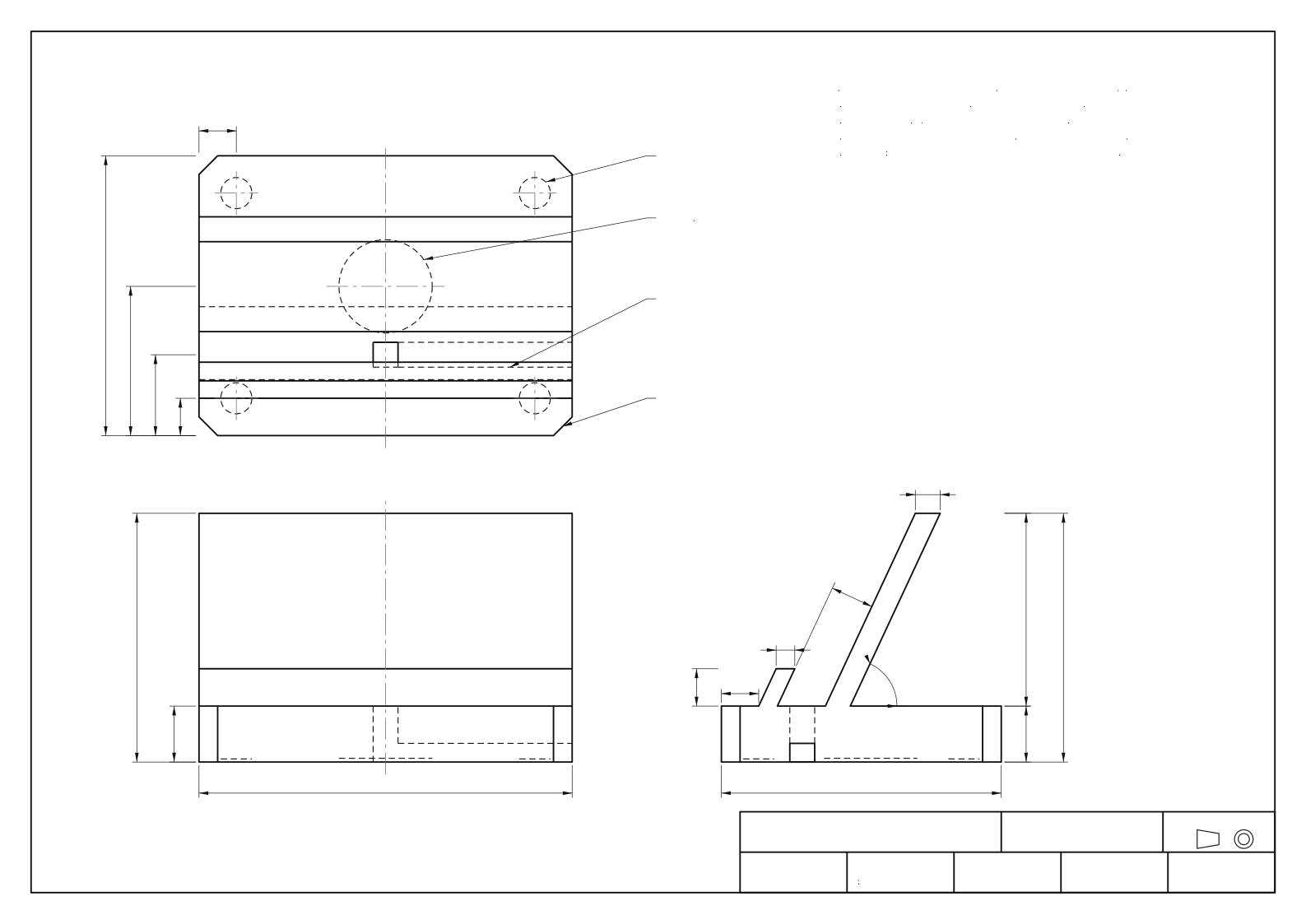
Dimensioned drawing

Third-angle projection: top view above the front view, right side view to its right. Hidden edges are dashed. Generated from the same parameters as the 3D model, so the two cannot drift apart.

NFC Thought Dock, dimensioned multiview drawingThird-angle projection with top, front and right side views. Base 120 by 90 by 18 millimetres with 6 millimetre corner chamfers. Phone slot 14 millimetres wide at 65 degrees, overall height 80. Underside: 30 millimetre NFC tag pocket 1.2 deep, 8 millimetre cable channel, four 10 millimetre foot recesses 1 deep.TOP VIEW1226489012⌀30 × 1.2 DP, UNDERSIDENFC TAG POCKET (NTAG215)4× ⌀10 × 1 DP, UNDERSIDERUBBER FOOT RECESSCABLE CHANNEL 8 W × 6 DPUNDERSIDE, EXITS RIGHT SIDE8 × 8 THRU SLOT FLOOR4× CHAMFER 6 × 45°FRONT VIEW1201880RIGHT SIDE VIEW9018628012126814 SLOT65°NOTES1. ALL DIMENSIONS IN MILLIMETRES. GENERAL TOLERANCE ±0.2.2. THIRD-ANGLE PROJECTION. HIDDEN EDGES DASHED.3. MATERIAL PLA. 0.2 LAYERS, 20% INFILL, 3 WALLS.4. PRINT LYING ON THE LEFT SIDE FACE. NO SUPPORTS NEEDED.5. NFC TAG: 30 MM NTAG215 STICKER, PRESSED INTO POCKET.TITLENFC THOUGHT DOCK (CONCEPT 1)DRAWN BYTEAM THOUGHT DOCKPROJECTIONUNITSmmSCALE1:1 ON A3DATE2026-10-15MATERIALPLASHEET1 OF 1
On narrow screens, scroll the drawing sideways or download the SVG. Print settings and assembly notes: docs/3D_DOCK.md (opens in a new tab).

05 Prototyping

Each round got a little more real.

We climbed the fidelity ladder one rung at a time and only moved up when the cheaper version had nothing left to teach.

The method
Prototyping makes an idea concrete enough to learn from. Low fidelity is fast and disposable; high fidelity looks real; a coded prototype behaves real.
How we used it
Wireframes for structure, high-fidelity screens for look and language, then a working build with real sync between phone and desk.
What it changed
Each round removed something: decisions from capture, color-only signals from the desk, and data-loss risks from sync.
  1. Round 1Low fidelity

    Paper and wireframes

    Sketched Capture and Sort as gray boxes to test the structure before any color or code.

    What it taught us. The capture screen only works if it asks for nothing. Category and date controls were considered and cut. Sort needed one big card and labeled actions, not a list with tiny icons.

    Low-fidelity wireframe of the Capture screenA phone with a wordmark and sync status at the top, one large text area, crossed-out category and due date controls, and a bottom bar with mic, photo, and a Save button.What's on your mind?Category ▾Due datecut: asks for a decisionLow-fidelity wireframe of the Sort viewA desktop window with a progress label, one large card holding a single thought, a suggestion chip, and a row of five labeled action buttons with keyboard keys.Sort · 3 of 7Looks like a TaskTask TEvent ESpace MKeep KArchive A← → next / previous · U undo
  2. Round 2High fidelity

    High-fidelity screens

    Applied the design contract: system type, one blue accent, black pills, the floating Dock, light and dark.

    What it taught us. Every action needed both a visible label and a key. The suggestion chip had to be quiet enough to ignore, and overdue items needed words like “Was due Tue” instead of red.

    Open them live. They are the real app.

  3. Round 3Working software

    Coded prototype

    Connected phone and desk through Next.js API routes and Upstash Redis, with QR pairing, an offline queue, voice and photo capture, and .ics export.

    What it taught us. Sync had to be optimistic: show the change instantly, queue it, retry when back online. Undo is only trustworthy if every action stores its exact inverse.

    • Pair: scan a QR code or type a short code, no account
    • Offline: captures queue locally and sync later
    • Undo: every change carries its inverse

Usability test plan

A moderated think-aloud test with 3 to 5 students on their own phones and a paired laptop. Ideally at least one participant navigates with the keyboard only.

Scenario

“Capture an application deadline and useful link on your phone. Later, turn the deadline into a task and save the link in an Engineering space.”

Tasks

  1. On the phone, capture the application deadline and the link.
  2. On the laptop, find that thought and turn the deadline into a task with a due date.
  3. Save the link in a space called Engineering. Create the space if it doesn't exist.
  4. Undo your last action, then redo it.

Moderator script

  1. 1Thanks for helping. We're testing the app, not you. There are no wrong answers.
  2. 2Please think out loud: say what you're looking for and what you expect to happen.
  3. 3Hand over the scenario card. Ask them to read it aloud, then start whenever they're ready.
  4. 4I can't help during a task, but you can stop any time.
  5. 5Afterward: What was easiest? What was confusing? Would you use this? Why or why not?
Completion
Done alone, done with a hint, or not done
Time on task
Seconds from first touch to done
Errors
Wrong action, wrong space, lost thought
Ease
Single Ease Question, 1 (very hard) to 7 (very easy)
Comments
Think-aloud notes, in the participant's words
Results: not yet run, team to record
ParticipantTask 1Task 2Task 3Task 4Ease (1–7)Notes
P1not recordednot recordednot recordednot recordednot recordednot recorded
P2not recordednot recordednot recordednot recordednot recordednot recorded
P3not recordednot recordednot recordednot recordednot recordednot recorded
P4not recordednot recordednot recordednot recordednot recordednot recorded
P5not recordednot recordednot recordednot recordednot recordednot recorded

Pending No sessions have been run. Results and the changes they lead to will be added here by the team.

06 UX/UI design

Quiet by design.

We wrote a one-page design contract before building any screen. Every color, size, label, and animation in the app comes from it.

The method
UX design decides how the product works: structure, flows, and behavior. UI design decides how it looks and reads: type, color, spacing, and motion. A design system keeps both consistent.
How we used it
We picked Apple's Human Interface Guidelines as the reference, set tokens for light and dark, fixed one label and one key per action, and wrote the accessibility floor as testable rules.
What it changed
The contract settled arguments quickly. When a feature needed a new color or a hidden gesture, the answer was already written down: no.

Design principles

  1. 1

    Capture asks for nothing

    One field and Save. No lists, dates, or tags on the phone, ever.

  2. 2

    One thing at a time

    Sort shows a single thought, large, with a short list of labeled actions.

  3. 3

    Everything is reversible

    Undo on every action. Archive instead of delete. The original text is never changed.

  4. 4

    Words, not colors

    Status is always said in words with an icon. No red for overdue work.

  5. 5

    Calm by default

    System type, one accent, motion only where it explains where a thought went.

Tokens, light and dark

Each swatch shows the light value on the left and the dark value on the right. The dot is the live value in your current theme.

  • --bg

    Page

    #f5f5f7 · #000000

  • --surface

    Cards

    #ffffff · #1c1c1e

  • --raised

    Sheets, Dock

    #ffffff · #2c2c2e

  • --text

    Body text

    #1d1d1f · #f5f5f7

  • --text-2

    Secondary text

    #424245 · #d2d2d7

  • --muted

    Metadata, 13px+

    #6e6e73 · #a1a1a6

  • --accent

    Primary, focus, links

    #0071e3 · #2997ff

  • --ink

    Black pill buttons

    #1d1d1f · #f5f5f7

  • --warn

    Real errors only

    #b25000 · #ff9f0a

Kind tints. Always with the kind's icon and its word.

  • Task#0071e3 · #2997ff
  • Event#b2380b · #ff8a5c
  • Idea#8a5a00 · #ffd60a
  • Resource#1d7d36 · #30d158
  • Note#6e6e73 · #a1a1a6

Type scale

System font only, so it renders as SF Pro on Apple devices.

  • Heroclamp(2.6rem, 7vw, 5rem) · 600 · −0.03em
  • Section title~3.4rem · 600 · −0.03em
  • Sort card28px · 500 · −0.02em
  • Body17px / 1.47
  • Metadata13px, muted, never body copy
  • ⌘K T E MSF Mono 12px

Accessibility decisions

Contrast
WCAG 2.2 AA in both themes: body text 4.5:1 or better, large text and icons 3:1. Muted gray is only for secondary text.
Focus
A visible 3 px accent focus ring on every control. Every action is a real button with a label.
Reduced motion
Follows the system setting and has its own in-app toggle. Movement is removed; gentle fades remain.
No color-only meaning
Kinds always show an icon and a word. Overdue is “Was due Tue”, in words, not red.
Reversible actions
Undo everywhere; Archive instead of Delete. Hard delete only from Archive, with a confirm.
Gentle language
“Inbox clear. Nothing’s waiting on you.” No streaks, scores, or guilt.
Processing actions and keysSame label and same key everywhere. Keys are shortcuts, never the only way: every action is also a visible button.
ActionKeyWhat it does
Make a TaskTKind becomes task, optional due date; stays until done
Make an EventEDate and time; Add to Calendar downloads an .ics file
Move to SpaceMPick a space, type to filter, Enter to create one
DevelopDNotes under the original text, which never changes
ConnectCLink to other thoughts; links show both ways
KeepKFile as Idea, Note, or Resource without making a task
ArchiveAOut of the way, never deleted, restorable
Undo⌘ZUReverses the last action; a toast says what was undone
Next / previousJ↓↑Moves instantly, no animation. In Sort: → and ←
CaptureN⌘KFocuses the Dock
Shortcuts?Sheet listing every key

Screen map

Thought Dock screen mapCapture on the phone sends thoughts to the Inbox on the desk. From the Inbox, Sort shows one thought at a time and six actions send it to Tasks and Today, Calendar, Spaces, Kept, Archive, or keep it in place with Develop and Connect. Pairing links phone and desk with a QR code. Settings hold theme, reduce motion, and suggestions.Pair phone · scan a QR code or type a short code, no accountPHONEDESKCapture/capture · one fieldInboxeverything lands hereSortone at a timeor process from the list + detail paneTasks · TodayMake a Task TCalendar + .icsMake an Event ESpacesMove to Space MKept: Idea, Note, ResourceKeep KArchive (restorable)Archive ASame thought, more detailDevelop D · Connect CSettings · Light / Dark / System · Reduce motion · Show suggestions
Information architecture: every thought enters through Capture and the Inbox, and leaves through one labeled action.

07 Project management

Small sprints, one board.

We ran the project like a tiny Agile team, with GitHub Projects as our Jira: user stories, sprints, and a kanban board everyone could see.

The method
Agile plans work in short sprints, writes requirements as user stories with acceptance criteria, and makes progress visible on a kanban board so the team can adjust every few days.
How we used it
Four sprints from planning to demo. Each story has testable acceptance criteria, and the board shows who owns each card and where it stands.
What it changed
Writing accessibility as user stories made it part of the definition of done. The core flow isn't finished until the keyboard and undo criteria pass.
Roles
RoleWhoOwns
Product and design decisionsLuke, Nik, MaryamProblem, concept choice, what ships, what gets cut
AI buildClaude Code (orchestrator + subagents)Design system, code, tests, this portfolio, under the team's direction
QAThe team, plus ChatGPT as a second reviewerUsability test, reviewing builds, checking copy and accessibility
Report and copyLuke and MaryamHumanizing copy, project report sections, decision-matrix scoring

Sprint plan

  1. Sprint 0

    Plan and design

    Problem, personas, concepts, decision matrix criteria, design contract, board set up

  2. Sprint 1

    Core flow

    Capture, Inbox, Sort, the processing actions, phone–desk sync, QR pairing

  3. Sprint 2

    Accessibility polish

    Keyboard paths, focus, contrast in both themes, reduced motion, undo everywhere, offline queue

  4. Sprint 3

    Demo and report

    Usability sessions, report sections, launch video, presentation rehearsal

User stories

  • As a student on the bus, I want to save a thought with one hand in a few seconds, so that I don't lose it before I get home.

    Acceptance criteria

    • Capture opens with the cursor in the field
    • Save works with no other input
    • Shows “Saved to your inbox” with Undo
    • Works offline and syncs later
  • As a student at my desk, I want to sort my inbox one thought at a time, so that the pile has a clear end.

    Acceptance criteria

    • Sort shows one thought large
    • Every action is a labeled button and a key
    • Advancing shows the next thought
    • Empty inbox says “Inbox clear. Nothing's waiting on you.”
  • As a transfer applicant, I want to turn a captured deadline into a calendar event, so that it shows up where I already look.

    Acceptance criteria

    • Make an Event takes a date and time
    • Add to Calendar downloads a valid .ics file
    • Undo restores the original thought
  • As a keyboard-only user, I want to do everything without a mouse, so that I can work at my own speed.

    Acceptance criteria

    • Every control is reachable with Tab
    • Focus ring is always visible
    • Single-letter keys are ignored while typing
  • As a student who distrusts automation, I want suggestions I can ignore, so that nothing gets filed somewhere I didn't choose.

    Acceptance criteria

    • Suggestion appears as a chip only above 0.45 confidence
    • It never moves or changes an item on its own
    • Suggestions can be turned off in Settings

Board snapshot

A static copy from October 15, 2026. The live board is the source of truth.

Open the live board(opens in a new tab)

To do 5

  • Run usability test (3–5 students)Team
  • Score the decision matrixTeam
  • Write report sectionsTeam
  • Humanize marketing copyTeam
  • Accessibility audit, both themesTeam

In progress 4

  • Capture screen
  • DeskOS and Sort
  • Train text classifier
  • Landing page

Review 1

  • Process portfolio (/jared)

Done 4

  • Design contract and tokens
  • Data layer and API routes
  • Upstash Redis storage
  • Shared icon set

Teammate tasks. Luke and Maryam own the humanized copy, the project report sections, the usability test, and the decision-matrix scoring.

08 Long-horizon AI task

One agent, many hours, many stages.

We built Thought Dock with AI agents, and we want to be clear about how. Claude Code acted as design lead and builder. The product decisions were ours.

The method
A long-horizon AI task is work an agent carries across hours and many steps: planning, building, checking its own output, and recovering from mistakes, instead of answering a single prompt.
How we used it
One orchestrating agent wrote the plan and the shared foundations, then split the build across parallel subagents, each in its own git worktree, with verification gates before anything could merge.
What it changed
Writing the design contract and data layer first, before any fan-out, kept four parallel builders consistent. Every subagent read the same rules and called the same data functions.
Timeline of the multi-agent buildThe orchestrator plans and writes the design contract, data layer, and API. It then forks four subagents in separate git worktrees: app UI, classifier, this portfolio, and the landing page with launch video. Each subagent passes typecheck, lint, build, and tests. The orchestrator reviews and merges, then runs a full build. The team checks in at four points: choosing the problem and concept, approving the design contract, choosing what merges, and running the usability test and scoring.PLANFOUNDATIONSPARALLEL BUILD IN WORKTREESMERGE AND VERIFYTeamOrchestratorApp UIClassifierPortfolioLanding + videoSUBAGENTSProblem + conceptDesign contractWhat mergesTest + scoringplan · tokens · data layer · API routesanswers questions, watches logsreview · merge · full buildown worktree + branchown worktree + branchown worktree + branchown worktree + branch● tsc · lint · build · tests
How the build was run. Lanes are who did the work; diamonds are human checkpoints.

Checkpoints and logs

Each stage ends in a commit, so any step can be inspected or rolled back. The agent keeps two running files in the repo: a run log of what it did and why, and a decision log of choices that a person should be able to question.

Verification gates

A branch is only ready to merge when all of these pass on it.

  1. 1Typechecknpx tsc --noEmit
  2. 2Lintnpx eslint …
  3. 3Buildnpm run build
  4. 4Testsclassifier evaluation, export self-checks

Where humans stayed in control

Humans choose
The problem, the concept, the design direction, and what gets cut were team decisions. The agent proposed; we picked.
Humans approve
Nothing is pushed, posted, or deployed without a person saying yes. Merges happen after review.
Humans verify
The usability test, decision-matrix scores, and report writing are ours, and the page says so where they're pending.

09 Coding

Small, boring, and reliable.

Two web pages, four API routes, one Redis database, and a model small enough to run in the browser.

The method
Software architecture decides where code runs, where data lives, and how the pieces talk. A clear data model keeps every screen working from the same facts.
How we used it
Both screens use one hook that applies every change instantly, queues it locally, and syncs it through API routes. The desk polls every 4 seconds while visible. No accounts: a dock ID is the key.
What it changed
Choosing operations (put, del) instead of whole-document saves meant phone and desk can edit different thoughts at once without overwriting each other, and Undo came almost for free.
Thought Dock architectureThe phone runs Capture with an offline queue in local storage. The desk runs DeskOS, which polls every 4 seconds and runs the classifier in the browser. Both send batches of operations to Next.js API routes on Vercel, which read and write Upstash Redis: one hash for items and one for spaces per dock. Pairing uses a short code or QR from the desk that the phone redeems once.BROWSERVERCELDATAPhone · Capture/capture · text, voice, photooffline queue in localStorageoptimistic: saved before the networkDesk · DeskOS/desk · Inbox, Sort, Spaces, Archivepolls every 4 s while visibleClassifier runs in the browserNext.js API routesPOST /api/dockcreate a dockGET /api/dock/:idload items + spacesPATCH /api/dock/:idapply ≤200 ops…/media/:itemvoice + photo blobs/api/pairshort code ↔ dockUpstash Redisper dock:td:id:items (hash)td:id:spaces (hash)kept 180 days afterthe last writeopspoll + opspair once: QR or code
Architecture. Solid arrows carry data; the dashed arrow is the one-time pairing step.

Data model

From lib/types.ts, lightly condensed.

type Item = {
  id: string;
  text: string;          // captured verbatim, never edited
  body?: string;         // "Develop" notes
  status: "inbox" | "kept" | "archived";
  kind?: "task" | "event" | "idea" | "resource" | "note";
  spaceId?: string | null;
  due?: string;          // task, YYYY-MM-DD
  at?: string;           // event, local datetime
  links: string[];       // connected thoughts, kept symmetric
  media?: { type: "audio" | "image"; mime: string };
  source?: "phone" | "desk";
  createdAt: number; updatedAt: number;
};

type Space = { id: string; name: string; createdAt: number };

// Every change is an operation; undo replays the inverse.
type Op =
  | { op: "put"; item: Item }
  | { op: "del"; id: string }
  | { op: "putSpace"; space: Space }
  | { op: "delSpace"; id: string };

Tech stack

Framework
Next.js 16 (App Router), React 19, TypeScript
Styling
Tailwind CSS v4 with design tokens as CSS variables
Storage
Upstash Redis through the Vercel Marketplace (free tier); in-memory fallback for local dev
Hosting
Vercel: static pages plus API route functions
Pairing
QR code (qrcode.react) or a 6-character code that expires in 10 minutes
Classifier
Logistic regression written from scratch in TypeScript, trained on synthetic labeled data
3D
three.js for the dock viewer and STL export

How to run it

npm ci
npm run dev            # http://localhost:3000
# optional: real storage
# KV_REST_API_URL=…  KV_REST_API_TOKEN=…  (from Vercel → Upstash)

npx tsc --noEmit       # typecheck
npm run lint           # eslint
npm run build          # production build
node scripts/export-stl.ts   # dock STL + drawing (self-checked)

Testing

  • Static checks. Typecheck, lint, and a production build must pass on every branch before merge.
  • Classifier. Trained and evaluated on held-out synthetic data. Metrics and limits are in the model card (opens in a new tab). It only ever suggests.
  • 3D export. The export script checks that the mesh volume matches the volume computed from the dimensions.
  • People. The usability test is the one that matters most, and it hasn't run yet.

Browse the code on GitHub (opens in a new tab)

10 Lessons learned

What we're taking with us.

This section is still being written. These are early lessons; each of us will add our own after the usability test.

  • Cutting is a design decision.

    Saying no to the hardware dock and to automatic AI filing gave us the time to make the core flow accessible.

  • Write the rules before the screens.

    A one-page design contract kept a multi-agent build looking like one product.

  • Honesty scales better than polish.

    Marking what is assumed or not yet tested made the page easier to trust and easier to finish.

Luke

Personal reflection to come.

Nik

Personal reflection to come.

Maryam

Personal reflection to come.

Pending Each teammate adds 2–3 lessons in their own words for the design report.